
Color is one of the first things people notice in any design. It’s the silent ambassador of your message, influencing perceptions and actions before a single word is read. Whether you’re designing a logo, website, app, or product packaging, color theory plays a pivotal role in ensuring your work connects with your audience with Logkeys.
Let’s face it, we’ve all been moved by a bold red ad or soothed by a pastel-themed website. That’s not coincidence—it’s color theory at play.
🎨 Understanding the Basics of Color Theory
The Color Wheel: Primary, Secondary, and Tertiary Colors
The color wheel is the foundation of color theory. Developed by Sir Isaac Newton in the 17th century, it remains the go-to model for understanding color relationships.
Primary Colors
These are red, blue, and yellow. They cannot be made by mixing other colors.
Secondary Colors
Mix any two primary colors and you get a secondary:
-
Red + Blue = Purple
-
Blue + Yellow = Green
-
Red + Yellow = Orange
Tertiary Colors
These are made by combining a primary and a secondary color. Examples include:
-
Blue-green
-
Red-orange
-
Yellow-purple
Warm vs Cool Colors
-
Warm colors (red, orange, yellow) evoke energy, passion, and warmth.
-
Cool colors (blue, green, purple) suggest calm, peace, and professionalism.
Hue, Saturation, and Value (HSV)
-
Hue is the pure color.
-
Saturation describes intensity (vivid vs dull).
-
Value is how light or dark a color is.
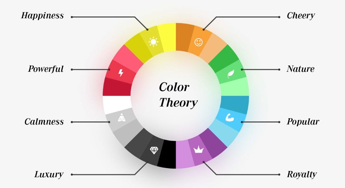
🧠 Psychological Impact of Colors
The Emotional Connection to Color
Colors affect moods. Here’s how:
-
Red: urgency, excitement, passion
-
Blue: trust, serenity, intelligence
-
Green: health, tranquility, nature
-
Yellow: optimism, clarity, caution
-
Purple: luxury, creativity, mystery
-
Black: power, elegance, sophistication
Color Associations Across Cultures
-
White = purity in the West, mourning in some Eastern cultures.
-
Red = love in the West, luck in China.
Cultural context matters.
Gender Perception and Color Preferences
Research shows women lean towards soft tints while men prefer bold shades. But this is evolving, especially in modern design focused on inclusivity.
🎯 Color Harmony in Design
Complementary Colors
Opposite on the wheel. Example: blue and orange. High contrast, high energy.
Analogous Colors
Side-by-side on the wheel. Smooth and serene, like blue-green-purple.
Triadic and Tetradic Color Schemes
-
Triadic: evenly spaced (e.g., red, yellow, blue)
-
Tetradic: two complementary pairs, forming a rectangle.
These offer balance and diversity.
👁️ Color Context and Perception
Simultaneous Contrast
Colors affect each other’s appearance when placed side-by-side.
The Role of Background in Color Interpretation
A gray object on a white background looks darker than the same object on black. Mind-blowing, right?
Visual Hierarchy Through Color
Use bold, contrasting colors to highlight key content. Subtle colors for background elements.
🏷️ Color in Branding and Marketing
How Brands Use Color to Shape Identity
Color = brand personality.
-
Coca-Cola: bold red → excitement
-
Facebook: blue → trust and professionalism
-
McDonald’s: red and yellow → appetite and speed
Examples of Famous Color Schemes
-
Google: playful mix of primary colors
-
Starbucks: green = growth and calm
-
Nike: black = power and elegance
Conversion Rates and Color in Web Design
Buttons with high-contrast colors (like orange on blue) boost conversions. Color literally drives clicks.
🔧 Tools and Resources for Applying Color Theory
Online Color Palette Tools
-
Coolors.co
-
Adobe Color Wheel
-
Paletton
Apps and Plugins for Designers
-
Figma plugins
-
Canva color palettes
-
Material UI Color Tool
Tips for Testing and Improving Your Palette
-
Use A/B testing
-
Check for contrast ratios
-
View on multiple screens
🖨️ Color Theory in Digital vs. Print Design
RGB vs CMYK Models
-
RGB (Red, Green, Blue): for screens
-
CMYK (Cyan, Magenta, Yellow, Black): for print
Design accordingly to avoid surprises.
Printing Pitfalls and Color Calibration
Calibrate your monitor and use Pantone guides for color accuracy in print.
♿ Accessibility and Inclusivity in Color Design
Designing for Color Blindness
Use patterns and icons alongside color. Tools like Coblis help test accessibility.
Ensuring Readability and Contrast
Always aim for a contrast ratio of at least 4.5:1 between text and background.
🎨 Current Color Trends in Design
2025’s Trending Color Palettes
Expect earthy tones mixed with neon pops. Think digital meets nature.
Influences from Nature, Tech, and Culture
-
Sustainability drives green palettes
-
Tech inspires cyberpunk hues
-
Social trends bring pastel resurgence
📊 Case Studies of Color Theory in Action
Website Redesign Using Color Psychology
A SaaS brand switched from blue-gray to teal-orange and saw a 35% rise in engagement.
UI Overhaul with Strategic Color Use
A mobile banking app used soft greens and golds to create a sense of trust and prosperity.
🚫 Common Mistakes in Applying Color Theory
Overusing Vibrant Colors
Too much intensity can overwhelm users. Balance is key.
Ignoring Brand Consistency
Your palette should align with your message and values. Don’t confuse your audience.
🎨 How to Build Your Own Color Palette
Starting with a Base Color
Choose one primary brand color. Build from there.
Expanding into a Full Theme
Add 2-3 secondary colors, a background tone, and one accent.
🧾 Conclusion
Color isn’t just decoration—it’s communication. It influences mood, drives action, and builds identity. By understanding and applying color theory, you elevate your designs from “okay” to unforgettable. Whether you’re branding a business or polishing your portfolio, color is your most powerful tool. Master it, and you’ll design with purpose.
❓ FAQs
Q1: What’s the difference between hue and tint?
Hue is the base color. Tint is when white is added to a hue.
Q2: Why do certain colors feel more calming?
Cool colors (like blue and green) trigger feelings of calm and trust in our brain.
Q3: Can color theory really improve conversions?
Absolutely! Button and call-to-action color changes can increase clicks significantly.
Q4: What’s the best color scheme for websites?
There’s no one-size-fits-all. It depends on your brand, audience, and message.
Q5: How can I make my designs color-blind friendly?
Use high contrast, avoid red-green combinations, and test with color-blind simulators.
Click Here For: Creative Digital Design